There are two kinds of Microsoft Excel users in the world: Those who make neat little tables, and those who amaze their colleagues with sophisticated charts, data analysis, and seemingly magical formula and macro tricks. You, obviously, are one of the latter—or are you? Check our list of 11 essential Excel skills to prove it—or discreetly pick up any you might have missed.
Vlookup
Vlookup is the power tool every Excel user should know. It helps you herd data that's scattered across different sheets and workbooks and bring those sheets into a central location to create reports and summaries.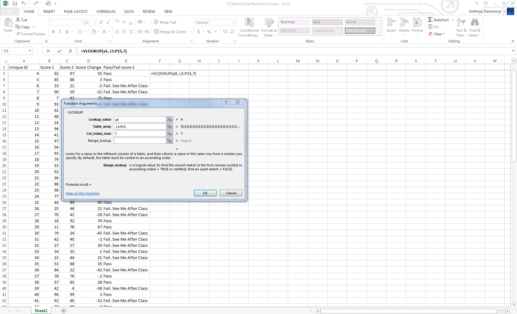
Summon the Vlookup formula in the formula menu and enter the cell that contains your reference number. Then enter the range of cells in the sheet or workbook from which you need to pull data, the column number for the data point you’re looking for, and either “True” (if you want the closest reference match) or “False” (if you require an exact match).
Creating charts
To create a chart, enter data into Excel with column headers, then select Insert > Chart > Chart Type. Excel 2013 even includes a Recommended Charts section with layouts based on the type of data you’re working with. Once the generic version of that chart is created, go to the Chart Tools menus to customize it. Don't be afraid to play around in here—there are a surprising number of options.
IF formulas
IF and IFERROR are the two most useful IF formulas in Excel. The IF formula lets you use conditional formulas that calculate one way when a certain thing is true, and another way when false. For example, you can identify students who scored 80 points or higher by having the cell report “Pass” if the score in column C is above 80, and “Fail” if it’s 79 or below.
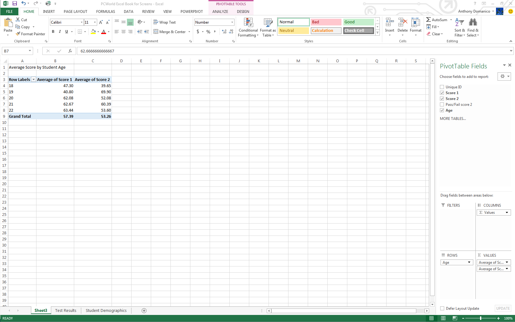
PivotTables
PivotTables are essentially summary tables that let you count, average, sum, and perform other calculations according to the reference points you enter. Excel 2013 added Recommended PivotTables, making it even easier to create a table that displays the data you need.To create a PivotTable manually, ensure your data is titled appropriately, then go to Insert > PivotTable and select your data range. The top half of the right-hand-side bar that appears has all your available fields, and the bottom half is the area you use to generate the table.
PivotChart
Part PivotTable, part traditional Excel chart, a PivotChart lets you quickly and easily look at complex data sets in an easy-to-digest way. PivotCharts have many of the same functions as traditional charts, with data series, categories, and the like, but they add interactive filters so you can browse through data subsets.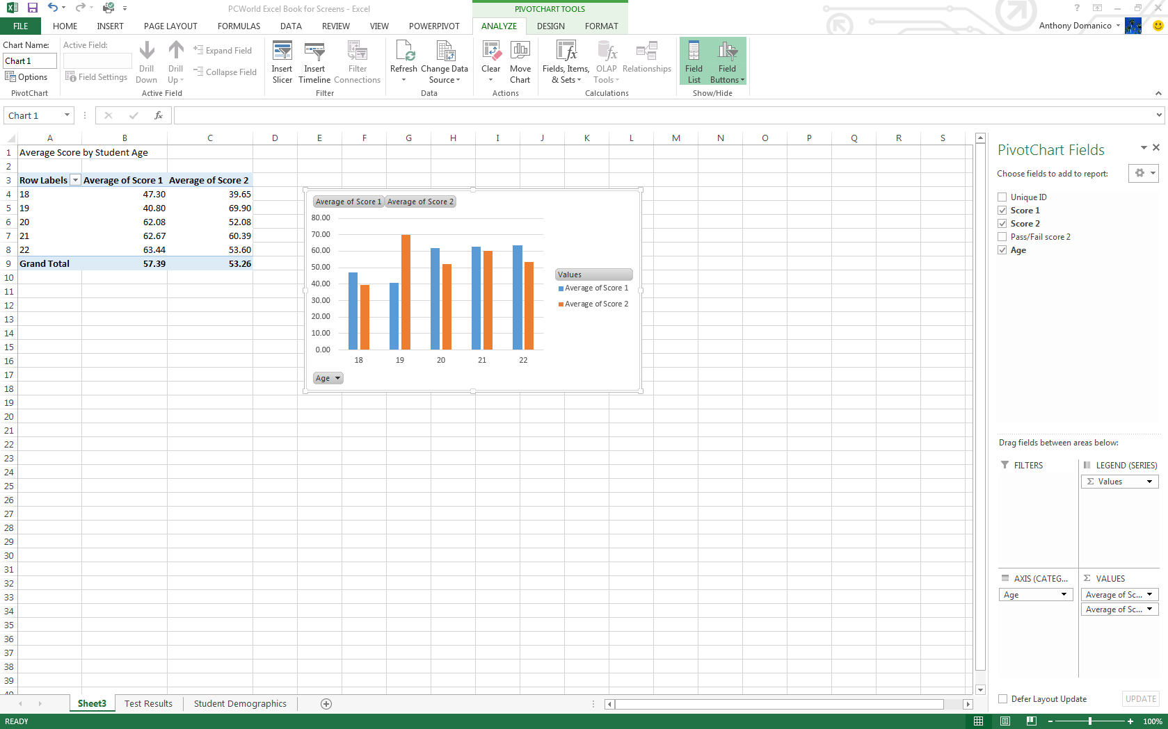
Flash Fill
Easily the best new feature in Excel 2013, Flash Fill solves one of the most frustrating problems of Excel: pulling needed pieces of information from a concatenated cell. When you’re working in a column with names in “Last, First” format, for example, you historically had to either type everything out manually or create an often-complicated workaround.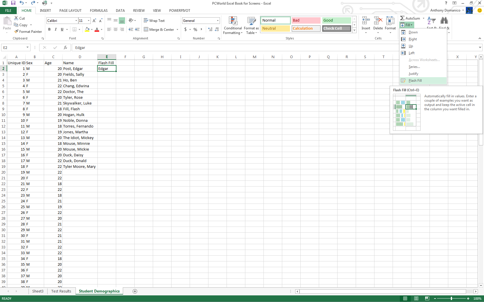
Quick Analysis
Excel 2013’s new Quick Analysis tool minimizes the time needed to create charts based on simple data sets. Once you have your data selected, an icon appears in the bottom right hand corner that, when clicked, brings up the Quick Analysis menu.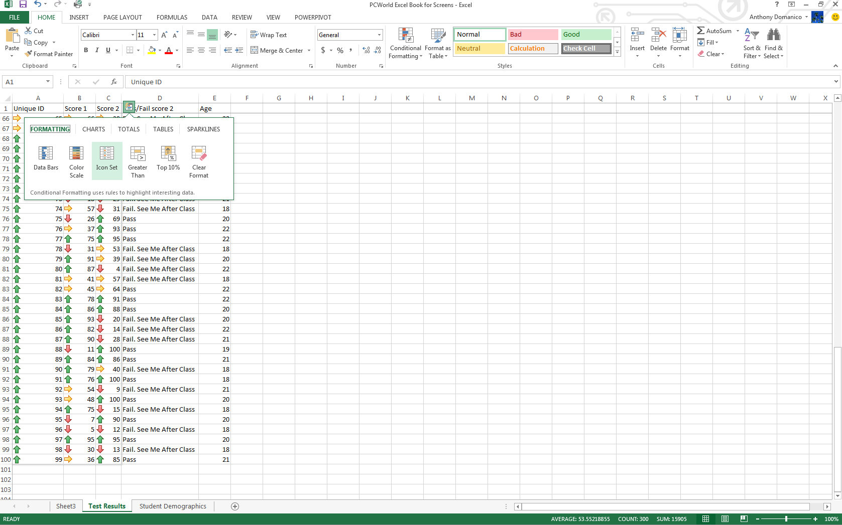
Power View
Power View is an interactive data exploration and visualization tool that can pull and analyze large quantities of data from external data files. Go to Insert > Reports in Excel 2013.
Conditional Formatting
For most tables, Excel’s extensive conditional formatting functionality lets you easily identify data points of interest. Find this feature on the Home tab in the taskbar. Select the range of cells you want to format, then click the Conditional Formatting dropdown. The features you’ll use most often are in the Highlight Cells Rules submenu.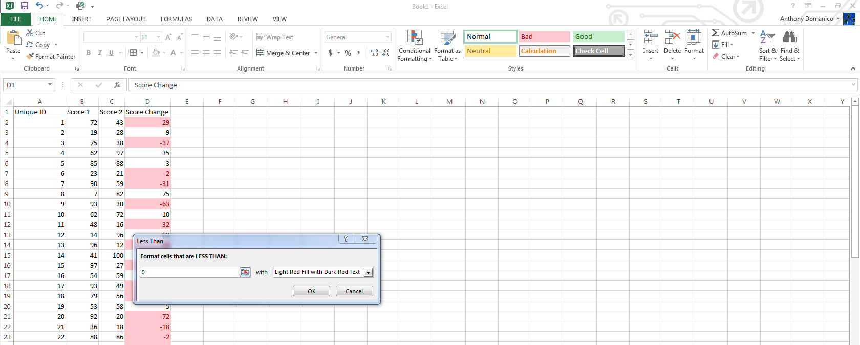
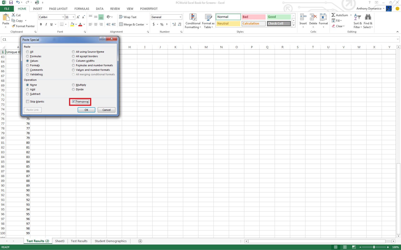
Transposing columns into rows (and vice versa)
Sometimes you’ll be working with data formatted in columns and you really need it to be in rows (or the other way around). Simply copy the row or column you’d like to transpose, right click on the destination cell and select Paste Special. A checkbox on the bottom of the resulting popup window is labeled Transpose. Check the box and click OK. Excel will do the rest.